Why Your Business Needs a Mobile-Friendly Website to Win More Customers
Customers increasingly use smartphones to search for businesses, compare products, find services, and communicate with companies. Therefore, having a mobile friendly website is no longer simply an optional feature for businesses that want to compete online. Instead, it has become an important part of creating a convenient customer experience and building a strong digital presence.
Whether you operate a small business, professional service, e-commerce store, or corporate company, your website should work properly across smartphones and other screen sizes. Moreover, a website that is easy to navigate on mobile devices can help visitors find information faster, contact your business, and take action.
What Is a Mobile-Friendly Website?
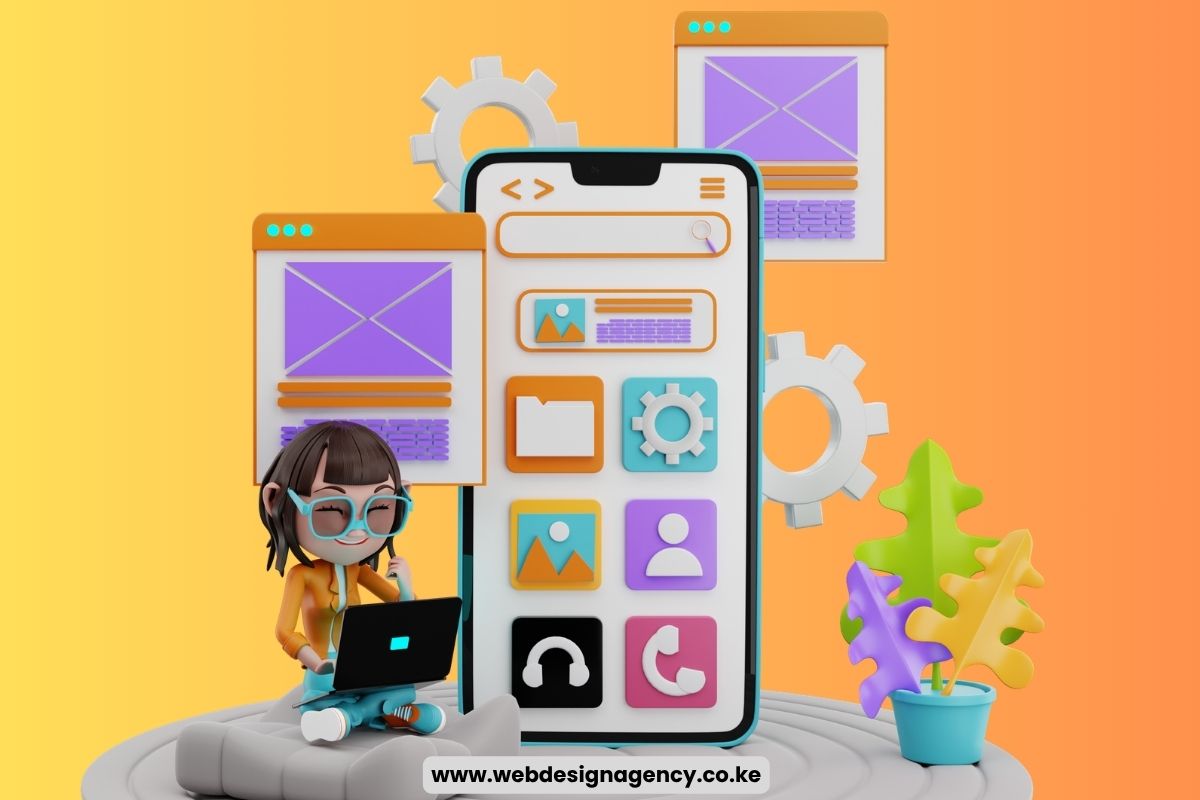
A mobile friendly website is designed to display and function properly on smartphones and other mobile devices. Instead of forcing users to zoom, scroll horizontally, or struggle with small buttons, the website automatically adjusts its layout to fit different screen sizes.
A mobile-friendly design typically includes:
- Responsive page layouts
- Easy-to-read text
- Mobile-friendly navigation
- Appropriately sized buttons
- Fast-loading pages
- Optimised images
- Easy-to-use forms
Consequently, visitors can browse your website more comfortably regardless of the device they use.
Why Does Mobile-Friendliness Matter for Businesses?
A large number of customers use mobile devices when researching businesses online. As a result, businesses that provide a poor mobile experience may lose potential customers before they even make contact.
Furthermore, mobile optimisation can influence how visitors perceive your business. A website that looks professional and works smoothly can create greater confidence, while a difficult-to-use website can encourage visitors to look elsewhere.
Benefits of Having a Mobile-Friendly Website
Having a mobile-friendly website can help your business provide a better online experience while creating more opportunities to attract and convert customers.
1. Reaches More Mobile Users
Smartphones allow customers to search for products and services from almost anywhere. Therefore, your website should work properly on smaller screens.
- Wider reach: Allows customers to access your website using smartphones, tablets, laptops, and desktops.
- Better accessibility: Ensures your products, services, and business information remain easy to access.
- More opportunities: Helps you reach customers who prefer browsing and shopping on mobile devices.
2. Improves User Experience
Visitors are more likely to stay on a website when they can navigate it easily.
- Easy navigation: Makes menus and important pages easier to find.
- Readable content: Ensures text is clear without requiring users to zoom.
- Easy interaction: Allows visitors to click buttons, complete forms, and browse pages comfortably.
3. Helps Increase Customer Engagement
A well-designed mobile website makes it easier for visitors to interact with your business.
- Product browsing: Customers can explore your products and services.
- Direct communication: Visitors can call, send WhatsApp messages, or submit enquiries.
- Easy enquiries: Customers can request quotations, bookings, or additional information.
- Location access: Map integration can help customers find your physical business.
4. Supports Search Engine Visibility
Mobile usability contributes to the overall experience search engines consider when evaluating websites.
- Mobile optimisation: Provides a consistent experience for visitors coming from search results.
- Better usability: Makes your website easier for visitors to navigate.
- SEO foundation: Supports other SEO efforts such as quality content, technical optimisation, and page speed.
5. Builds Professional Credibility
Your website can influence how potential customers perceive your business.
- Professional appearance: A responsive design can create a positive first impression.
- Customer confidence: A well-organised website can make your business appear more reliable.
- Brand image: Consistent design across devices can strengthen your overall brand presentation.
6. Improves Page Accessibility
Customers use different devices and screen sizes to access websites. Therefore, your website should adjust accordingly.
- Flexible layouts: Content can automatically adjust to different screen sizes.
- Better readability: Text and images remain easier to view on smaller screens.
- Less scrolling: Visitors can access important information without excessive zooming or horizontal scrolling.
7. Can Increase Conversions
A smoother mobile experience can make it easier for customers to complete important actions.
- Simpler purchases: Online stores can make product selection and checkout easier.
- Clear calls to action: Buttons can encourage visitors to call, message, book, or request a quotation.
- Easier checkout: A simple mobile checkout can reduce unnecessary difficulties during purchases.
8. Gives You a Competitive Advantage
If competitors provide better mobile experiences, customers may choose them instead. Therefore, mobile optimisation can help your business remain competitive.
- Stand out: A smooth mobile experience can differentiate your business from competitors.
- Meet customer expectations: Makes it easier for customers to interact with your business.
- Show attention to detail: A responsive website demonstrates that you value convenience and accessibility.
Features of a Good Mobile-Friendly Website
Creating a mobile-friendly website requires more than simply shrinking the desktop version. Instead, the website should be designed to provide a smooth and convenient experience on smaller screens.
- Responsive design: Automatically adjusts the website layout, images, and content to fit different screen sizes.
- Simple navigation: Makes it easy for visitors to find important pages without going through complicated menus.
- Fast page loading: Helps visitors access content quickly and reduces the chances of them leaving due to slow loading.
- Readable fonts: Uses clear and appropriately sized text that visitors can read comfortably without zooming.
- Touch-friendly buttons: Provides buttons that are large enough to tap easily on smartphone screens.
- Optimised images: Compresses images and uses suitable formats to improve loading speed without significantly affecting quality.
- Mobile-friendly forms: Keeps contact, booking, and enquiry forms simple and easy to complete on smaller screens.
- Clear calls to action: Uses visible buttons such as “Call Now,” “Buy Now,” “Get a Quote,” or “Contact Us” to guide visitors.
- Easy-to-use menus: Uses simple mobile menus that allow visitors to access different sections quickly.
- Proper spacing: Provides enough space between text, buttons, images, and other elements to prevent accidental clicks and improve readability.
Mobile-Friendly Website for E-commerce Businesses
For online stores, mobile usability can be particularly important because customers may browse products and make purchases directly from their phones. A mobile friendly website should make it easy to:
- Browse product categories
- Search for products
- View product images
- Read descriptions
- Select product variations
- Add products to the cart
- Complete checkout
- Choose payment options
- Track orders
Additionally, businesses should test their checkout process carefully. A complicated mobile checkout can discourage customers from completing purchases.
Mobile-Friendly Website for Service Businesses
Service-based businesses can also benefit significantly from mobile optimisation. For example, customers searching for an insurance agency, digital marketing agency, restaurant, salon, repair company, or professional service may want to contact the business immediately. Therefore, your website should make important actions simple.
You can include:
- Click-to-call buttons
- WhatsApp buttons
- Contact forms
- Booking forms
- Business location maps
- Service information
- Opening hours
- Customer reviews
Consequently, visitors can quickly move from searching for information to contacting your business.
How to Make Your Website Mobile-Friendly
If your existing website does not work well on mobile devices, you can make several improvements to create a smoother browsing experience.
- Use responsive design: Make sure your website automatically adjusts its layout, images, and content to different screen sizes, eliminating the need for separate mobile and desktop websites.
- Optimise images: Compress large images and use suitable file formats to reduce loading times while maintaining good visual quality.
- Simplify navigation: Use clear and simple menus so visitors can quickly find important pages without struggling on smaller screens.
- Improve page speed: Optimise images, reduce unnecessary scripts, enable caching, and use reliable hosting to help pages load faster.
- Make buttons easy to use: Use appropriately sized buttons with enough space between them so mobile users can tap them comfortably.
- Simplify forms: Keep contact, booking, and enquiry forms short by requesting only essential information, making them easier to complete on smartphones.
How to Test Your Website on Mobile
After making changes, test your website on different devices and screen sizes.
Check whether:
- Text is easy to read
- Images display correctly
- Menus work properly
- Buttons are easy to tap
- Forms function correctly
- Pages load quickly
- Content fits the screen
- Checkout works properly
Additionally, test your website using different browsers because performance can vary across devices and software.
Common Mobile Website Mistakes to Avoid
Even businesses with responsive websites can make mistakes that negatively affect the mobile user experience. Therefore, watch out for the following:
- Tiny text: Small text can be difficult to read on smartphone screens, forcing visitors to zoom in.
- Small buttons: Buttons that are too small can be difficult to tap and may lead to accidental clicks.
- Slow-loading images: Large, uncompressed images can increase loading times and frustrate visitors.
- Complicated menus: Complex navigation can make it difficult for mobile users to find important information.
- Excessive pop-ups: Too many pop-ups can interrupt browsing and make it difficult for visitors to access content.
- Horizontal scrolling: Visitors should not need to scroll sideways to view your website content.
- Long forms: Requiring too much information can discourage mobile visitors from completing enquiries or bookings.
- Unoptimised videos: Large videos can consume data and slow down page loading, particularly for users with limited connections.
- Difficult checkout processes: Complicated checkout steps can cause customers to abandon their purchases.
- Missing contact information: Make phone numbers, WhatsApp links, email addresses, and other contact options easy to find.
Avoiding these mistakes can create a smoother browsing experience, improve engagement, and make it easier for visitors to take action.
How a Mobile-Friendly Website Can Help You Win More Customers
A mobile-friendly website does more than make your website look good on a phone. It can help customers interact with your business more easily and encourage them to take action.
- Makes information easy to find: Customers can quickly access your services, products, prices, business hours, and other important information.
- Encourages direct communication: Features such as click-to-call and WhatsApp buttons allow potential customers to contact you conveniently.
- Supports faster decisions: A clear mobile layout helps visitors compare options and understand your products or services without unnecessary effort.
- Encourages purchases: For e-commerce businesses, simple product browsing and checkout can make it easier for customers to complete orders.
- Improves customer experience: Easy navigation and fast-loading pages can keep visitors engaged and reduce frustration.
- Encourages repeat visits: When customers have a positive experience, they may be more likely to return to your website.
- Supports recommendations: A convenient website experience can encourage satisfied customers to recommend your business to others.
- Strengthens customer acquisition: Therefore, mobile optimisation should form part of your broader strategy for attracting, engaging, and converting customers.
Frequently Asked Questions
1. What is a mobile-friendly website?
It is a website designed to work properly on smartphones and other mobile devices, with responsive layouts, readable text, easy navigation, and touch-friendly features.
2. Why does my business need a mobile-friendly website?
A mobile-friendly website helps customers browse your website comfortably, find information quickly, contact your business, and complete actions such as purchases or bookings.
3. Is mobile-friendly design important for SEO?
Yes. Mobile usability contributes to the overall page experience considered by search engines. However, SEO also depends on content quality, technical optimisation, relevance, speed, and other factors.
4. Does a mobile-friendly website work on tablets?
Yes. Responsive websites can adjust their layouts to work across smartphones, tablets, laptops, and desktop computers.
5. Can a mobile-friendly website increase sales?
It can support sales by making product browsing, navigation, payment, and checkout easier for mobile users. However, sales also depend on factors such as pricing, product quality, marketing, and customer trust.
6. How can I tell if my website is mobile-friendly?
Test your website on different smartphones and tablets and check whether the text, images, menus, forms, and buttons work properly. You can also use Google’s mobile usability and performance tools.
7. Does mobile optimisation require a separate website?
No. Responsive web design allows one website to adjust to different screen sizes, eliminating the need for a separate mobile website in most cases.
Build a Mobile-Ready Website With Web Design Agency
A mobile friendly website can help your business reach more customers, improve user experience, strengthen credibility, support SEO, and encourage visitors to take action. Therefore, businesses should treat mobile optimisation as an essential part of their digital strategy rather than an optional feature. Whether you run an online store, professional service, startup, or established company, a responsive website can make it easier for customers to interact with your brand from their phones. Ultimately, working with a professional web design agency can help you create a fast, responsive, secure, and user-friendly website that works across different devices. With the right web design agency, your business can provide a better online experience and create more opportunities to attract and convert customers.